Organize and plan better with theLIFEBOARD week calendar
2 min read
A product update about the latest feature: the new week page with an improved design and drag & drop support

The latest update of theLIFEBOARD is life and it comes with some minor design changes and improvements, and a big update. Let's go over the small changes first:
Cleaner design
During the last couple of weeks we've been slowly introducing small design changes to improve the user experiece, specially on mobile. We've reduced margins, padding between elements and font sizes to make the most of the space available on screen.

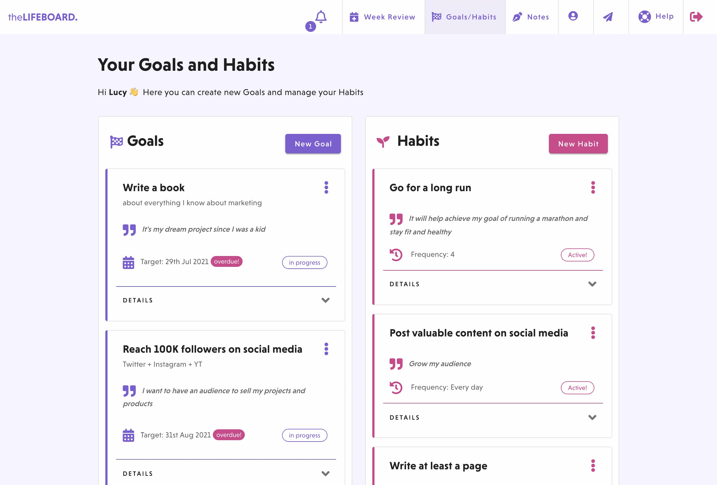
In addition, we've removed the purple header in all the pages and replaced it with a new lighter version that is more pleasant in the eyes. We've removed the shadows on the cards for each goal and habit and improved the task items on the week.
The big change: new week
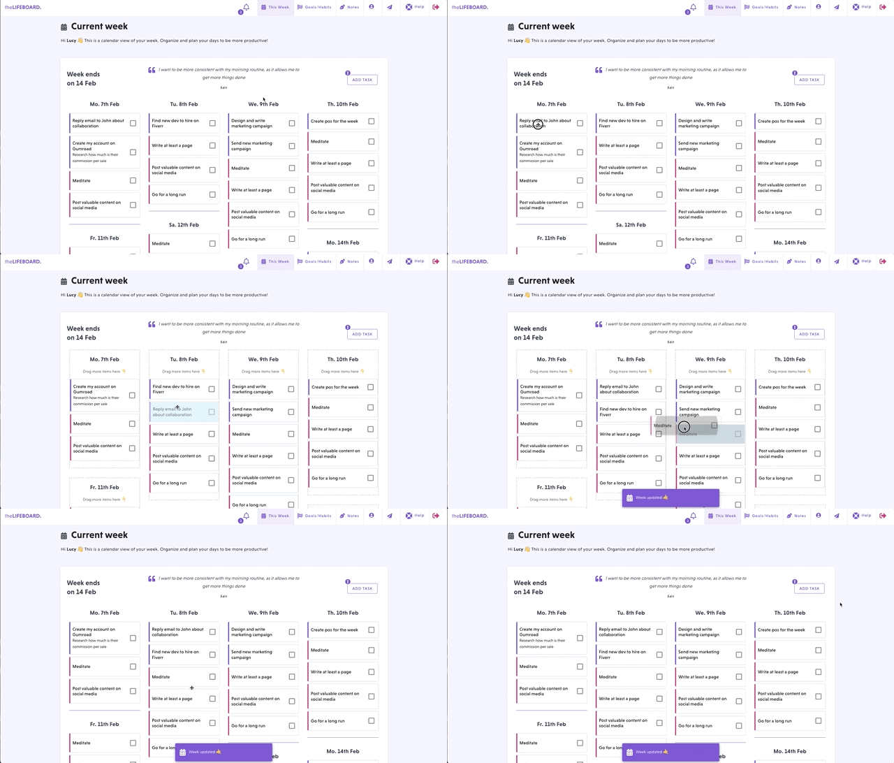
The big changes comes in the week page. After you complete your weekly review of the current week, the new one will look completly different. We've switched from a simple two-columns view for habits and tasks, to a calendar like view. In addition, you can move your tasks and habits to different days by dragging them as seen below:

If you're using theLIFEBOARD on your smartphone, just tap and hold and item for a moment before dragging it to another day.
You can easily differentiate between your habits and your goal related tasks by their color. As always, pink items are habits and tasks are purple.
If you need to add new tasks, just click on the "Add task" button on the top-right corner and to open the task form. In it, you'll be able to enter all the details of the task, including if it's related to any of your goals and the day you want to work on it.
We hope you enjoy this update and that it helps you organize your days better. And if you find any issues, you can send us a message from the app or from the contact page.

